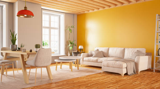

Paint is one of the few home improvements capable of changing how a room feels without changing its floor plan. The right color can make a compact room seem more open, bring warmth to a large living area, highlight architectural details, or create a calmer atmosphere in a bedroom.
For homeowners in Huntington Beach, interior paint choices can be particularly interesting because natural light, coastal-inspired architecture, open layouts, and indoor-outdoor living all influence how colors appear. Understanding these factors can help homeowners make choices that work with their home rather than simply following the latest color trend.
Start With the Natural Light in Each Room
A paint swatch viewed in a store does not necessarily represent how that color will look on a wall. Light has an enormous effect on color perception, and the appearance of a room can change throughout the day.
Rooms with abundant natural light offer considerable flexibility. However, bright sunlight can make certain colors appear lighter or more intense than expected. A subtle off-white, for example, may look significantly brighter on a sun-filled wall than it does on a small sample card.
Rooms with limited natural light require a different approach. Homeowners sometimes assume that painting a darker room bright white will automatically make it feel larger and sunnier. That can work, but it is not the only solution. In some spaces, a warmer neutral or intentionally deeper color can create a comfortable, finished appearance instead of fighting the room’s natural characteristics.
Before committing to a color, consider:
- How much direct sunlight the room receives
- What time of day the room is used most often
- The direction the windows face
- Existing flooring and furniture colors
- Artificial lighting and bulb temperature
- Colors visible through adjoining rooms
Testing potential colors directly in the room can provide a much better impression than selecting a shade from a small sample alone.
Use Color to Influence the Sense of Space
Paint cannot physically enlarge a room, but it can affect how spacious or enclosed that room feels.
Lighter colors generally reflect more light, which can contribute to an airy appearance. This approach can be useful in hallways, smaller bedrooms, compact bathrooms, and other areas where homeowners want to emphasize openness.
However, homeowners do not have to use the same pale neutral everywhere. Strategic variation can give individual spaces more character.
A darker accent wall can establish a focal point behind a bed, fireplace, or entertainment area. Painting built-in shelving a contrasting shade can turn a functional feature into an architectural detail. Using a slightly different tone in a dining area can visually distinguish it from an adjoining living room without constructing a wall.
This is particularly helpful in open-concept homes. Instead of relying on physical barriers, carefully coordinated colors can create subtle visual zones while maintaining the flow of the overall floor plan.
Think Beyond the Walls
When homeowners imagine an interior painting project, walls usually receive most of the attention. Yet trim, doors, ceilings, cabinets, and built-ins can have just as much influence on the finished appearance.
Traditional white trim remains popular because it creates a clean boundary around walls and architectural features. But it is far from the only option. Some homeowners use warmer off-whites for a softer transition, while others paint trim and walls in closely related tones for a more contemporary look.
Interior doors offer another opportunity. A contrasting door color can add depth to an otherwise neutral hallway or living space without requiring a major design change.
Ceilings deserve consideration as well. Standard white can create a crisp appearance and help reflect light, while using a variation of the wall color can produce a more unified effect.
For homeowners considering interior painting in Huntington Beach, evaluating walls alongside trim, ceilings, doors, and other painted surfaces can lead to a more cohesive result than choosing wall colors in isolation.
Match the Finish to How the Room Is Used
Color receives most of the attention during paint selection, but sheen can be equally important. Different finishes reflect different amounts of light and offer varying visual characteristics.
A flatter finish tends to reflect less light, which can help minimize the visibility of minor wall imperfections. Finishes with more sheen reflect additional light and can provide a different appearance.
Rather than choosing one finish for every surface, homeowners can consider how each space functions.
Bedrooms and Living Areas
These rooms often benefit from finishes that create a comfortable appearance without excessive shine. The exact choice can depend on wall condition, household activity, and personal preference.
Kitchens and High-Traffic Areas
Spaces exposed to frequent activity may benefit from finishes selected with maintenance and cleaning in mind. Hallways, entryways, and family rooms can experience regular contact that quieter rooms do not.
Trim and Doors
Baseboards, window casings, doors, and other architectural elements are often intentionally differentiated from walls. A finish with some sheen can visually define these details and create contrast even when the colors are similar.
The important point is that paint selection involves more than finding a favorite shade. Color, finish, lighting, surface type, and room function all work together.
Create Flow From Room to Room
A common challenge arises when homeowners select colors one room at a time. Each individual color may look attractive, yet the home can eventually feel disconnected.
A more cohesive approach starts with an overall palette.
That does not mean every room needs to be identical. Instead, homeowners can choose a small group of compatible colors and use them in different ways throughout the house.
For example, a primary neutral might appear in the living room and hallways. A related but slightly deeper shade could define the dining area. Bedrooms might introduce muted colors that complement the main palette, while trim provides a consistent element throughout the property.
Sightlines are especially important. Stand in the entryway, hallway, or main living area and notice how many rooms are visible at once. Colors do not have to match, but they should generally make sense when viewed together.
Repeating certain tones in furnishings, cabinetry, artwork, or architectural details can further connect different spaces.
Preparation Has a Major Effect on the Final Appearance
Even a carefully selected color will not look its best if the underlying surface is uneven or poorly prepared.
Walls commonly develop nail holes, dents, small cracks, scuffs, and previous repair marks. Older paint can also have inconsistent textures or visible imperfections.
Preparation may involve cleaning surfaces, repairing damaged areas, filling holes, sanding patches, protecting furniture and flooring, and priming appropriate surfaces before applying finish coats.
Detailed preparation is especially noticeable around trim and edges. Crisp transitions around baseboards, windows, ceilings, cabinets, and door frames contribute significantly to the finished appearance of a room.
Homeowners comparing painting estimates should therefore consider what preparation is included rather than evaluating projects solely by the number of coats specified.
Make Choices That Suit the Home, Not Just the Trend
Color trends can provide useful inspiration, but an interior should ultimately work for the people living in it.
Huntington Beach homeowners may naturally be drawn to light neutrals, muted blues, soft greens, sandy tones, and other colors associated with coastal design. Those palettes can work beautifully, but coastal style does not require turning every home into a themed beach house.
Architecture, flooring, cabinetry, furnishings, natural light, and personal preferences should have a stronger influence than any temporary trend.
The most successful interiors often use color to enhance features that are already present. Instead of asking which shade is currently fashionable, homeowners can ask which colors make their particular rooms feel brighter, calmer, warmer, more connected, or more distinctive.
A Thoughtful Paint Plan Can Transform an Interior
Interior painting can accomplish much more than covering an outdated wall color. Used strategically, paint can influence perceived room size, highlight architectural details, establish visual zones, and create better continuity throughout a home.
The process begins by looking carefully at natural light, existing materials, room function, and sightlines between spaces. From there, homeowners can build a coordinated palette and select appropriate finishes for walls, trim, doors, ceilings, and other surfaces.
Combined with careful preparation and clean application, those decisions can make an interior feel intentionally designed rather than simply repainted. For a Huntington Beach home, that thoughtful approach can create spaces that complement the area’s light and relaxed character while still reflecting the homeowner’s individual style.